Have you ever walked past a building or stepped into a room and instantly felt that it just “looks right”? It feels stable, comfortable, and visually pleasing, even if you cannot explain exactly why. Conversely, we have all seen buildings where something just “feels off”—the windows seem randomly scattered, the roof looks too heavy, or the entrance feels hidden.
When you react to a building in this way, you are responding to underlying rules of visual composition. In the architectural world, these are known as the principles of design. They are the fundamental guidelines that dictate how spaces, forms, materials, and light are organized to create functional, beautiful, and meaningful structures.
While different design schools and textbooks may categorize them slightly differently, the most widely accepted framework includes 7 key principles of design in architecture: Balance, Proportion (and Scale), Rhythm, Emphasis, Unity, Harmony, and Contrast.
In my experience teaching design and working on live projects, I see these 7 principles at play in almost every successful building. But at Construction Estimator India, we know that good architectural design does not just look good; it heavily influences construction feasibility, material quantities, and ultimately, your project budget.
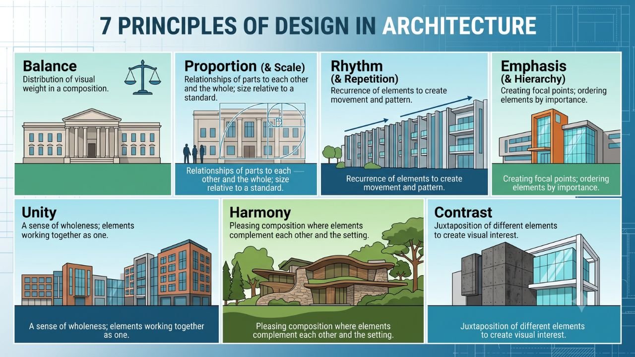
By the end of this comprehensive guide, you will clearly understand all 7 principles, how they are applied in real buildings, and why they matter for both aesthetics and construction costs.
(To understand the foundation of these concepts, you can explore this excellent overview of architectural design principles by ArchDaily, which highlights how architects organize space and experience).
Elements vs Principles of Design in Architecture (Quick Clarification)
Before we dive into the 7 principles, we must clear up a common confusion: the difference between the elements of design and the principles of design.
Elements of Design (The Raw Materials):
These are the basic building blocks of any visual composition. They include point, line, plane, volume, form, space, texture, color, and light. You cannot build a design without them.
Principles of Design (The Grammar Rules):
The principles are the guidelines for organizing those elements. They dictate how the lines, colors, and volumes are arranged to create order, meaning, and beauty.
A Simple Analogy:
Think of the elements as the words in a language. The principles are the grammar rules that help you arrange those words into a meaningful, poetic sentence. Throwing random words (elements) onto a page does not make a story; it requires grammar (principles) to make sense.
The 7 Principles of Design in Architecture – Overview
When I evaluate a design for a client, I run it through a mental checklist of these specific rules of composition. Here is the core framework:
-
Balance
-
Proportion and Scale
-
Rhythm and Repetition
-
Emphasis and Hierarchy
-
Unity
-
Harmony
-
Contrast
(Note: Some academic frameworks also include symmetry, simplicity, or character, but the 7 listed above form the universal core of design theory).
Summary of the 7 Principles
| Principle | What It Controls | Typical Question It Answers |
| Balance | Visual weight distribution | Does the design feel stable or tilted? |
| Proportion & Scale | Size relationships | Do parts relate well to each other and to humans? |
| Rhythm & Repetition | Visual movement | Is there a pattern or flow in the design? |
| Emphasis & Hierarchy | Focal points | What draws the eye first? What is most important? |
| Unity | Cohesion of parts | Do all elements feel like they belong together? |
| Harmony | Compatibility of elements | Do materials, forms, and colors work well together? |
| Contrast | Differences and drama | Are there interesting variations without chaos? |
1. Balance – Achieving Visual Equilibrium
If a building looks like it might tip over, it lacks balance.
Definition:
Balance refers to the distribution of visual weight in a design. Visual weight is determined by an element’s size, color, texture, and complexity. A balanced design feels stable, grounded, and structurally sound.
Types of balance:
-
Symmetrical Balance: The most formal type. Elements are mirrored exactly on either side of a central axis. (Think of the Taj Mahal or classical Greek temples).
-
Asymmetrical Balance: More dynamic and modern. Elements are not mirrored, but the visual weight is still equalized. For example, a large, plain concrete wall on the left might be balanced by a smaller, highly detailed wooden screen on the right.
-
Radial Balance: Elements radiate outward from a central point, common in domed structures or circular floor plans.
Why it matters:
A balanced design feels calm. Imbalance causes visual discomfort—the viewer subconsciously feels that something is wrong.
Cost Impact:
Achieving asymmetrical balance often requires complex structural engineering (like massive, floating cantilevers in modern villas), which requires heavier steel reinforcement, directly increasing your construction costs.
(For a deeper dive into visual equilibrium, read this detailed guide on balance in architecture by ArchitectureStudent).
2. Proportion and Scale – Relationships of Size
A beautifully detailed door is useless if it is only 4 feet tall.
Definition:
-
Proportion deals with the relative size of different elements within a design—how the width of a window relates to its height, or how a roof relates to the walls below it.
-
Scale refers to the size of an object relative to the human body (anthropometrics) or its surrounding environment.
Why it matters:
Good proportion creates a sense of harmony and comfort. Poor proportion makes spaces feel cramped, overwhelming, or awkward. Classical architecture relied heavily on mathematical proportions like the Golden Ratio (1:1.618) to achieve “perfect” beauty.
Examples:
-
In traditional Indian temple architecture, strict proportional systems dictate the exact height of the vimana (tower) relative to the base.
-
A grand double-height living room feels luxurious because of its grand scale, while a cozy reading nook relies on an intimate, smaller scale.
Cost Impact:
Playing with scale has massive financial implications. Doubling the ceiling height to create a “grand scale” doubles your brickwork, increases your plastering area, and drastically raises your long-term HVAC (air conditioning) running costs.
3. Rhythm and Repetition – Creating Visual Movement
Music has a beat, and buildings have rhythm.
Definition:
Rhythm in architecture is created by the repetition of elements—such as columns, windows, arches, or brick patterns—at regular or varied intervals. This repetition creates a visual tempo that guides the viewer’s eye smoothly across the facade or through a corridor.
Types of rhythm:
-
Regular Rhythm: Elements repeat at identical, consistent intervals (e.g., a long row of identical office windows).
-
Alternating Rhythm: Two or more elements alternate in a pattern (e.g., a pattern of large window, small window, large window).
-
Progressive Rhythm: Elements change gradually in a sequence, such as arches that slowly get smaller as a corridor narrows.
Examples:
-
The repetitive columns (colonnades) of classical Roman buildings.
-
The intricate, repetitive geometric jaali (lattice) screens found in Indo-Islamic architecture, which create a rhythm of light and shadow.
Cost Impact:
Rhythm is a fantastic tool for cost control. By repeating standard window sizes and column spacing across a facade, you minimize custom fabrication and simplify formwork, significantly reducing your labor and material costs.
(Learn more about visual tempo in this exploration of rhythm in design by the Interaction Design Foundation).
4. Emphasis and Hierarchy – Creating Focal Points
When you look at a building, where does your eye go first?
Definition:
Emphasis (or dominance) is the principle of creating a clear focal point in a design. It establishes a visual hierarchy, telling the viewer what is the most important part of the building.
How it is achieved:
-
Through Size: Making the main entrance double-height.
-
Through Color/Texture: Cladding a single feature wall in dark granite while the rest of the building is painted white.
-
Through Form: Adding a dome, a spire, or a unique canopy over a doorway.
Why it matters:
If every part of a building screams for attention, the design becomes chaotic and confusing. If nothing stands out, the building looks flat and boring like a simple warehouse. Emphasis guides the user—for example, making sure a visitor intuitively knows exactly where the main entrance is located.
Cost Impact:
Emphasis aligns perfectly with budget priorities. Smart architects save money by keeping 90% of the building simple and cost-effective, and spending their luxury budget exclusively on the 10% that matters (the focal point, like a dramatic entrance lobby or a central staircase).
5. Unity – Bringing Everything Together
A building should not look like it was designed by three different people who never spoke to each other.
Definition:
Unity is the overarching principle that brings all other principles together. It is the sense that all individual parts of a design belong to a single, cohesive whole.
How it is achieved:
-
Consistent use of a specific material palette (e.g., sticking to concrete, wood, and glass).
-
Carrying a specific geometric shape (like a curve or an arch) from the exterior facade into the interior doorways and furniture.
-
Clear organization of spaces and circulation.
Why it matters:
A design with strong unity feels complete and resolved. Without unity, even a collection of incredibly beautiful, expensive rooms will feel disjointed and confusing to walk through.
Cost Impact:
Unity naturally aids in cost control. By limiting the number of different materials, paints, and floor tiles used across a project, you reduce material wastage, simplify procurement, and allow contractors to work faster.
6. Harmony – Compatibility of Elements
While unity ensures the building feels like one whole, harmony ensures that the specific parts actually like each other.
Definition:
Harmony focuses on the compatibility of different elements—materials, forms, colors, textures—so they work together without visual conflict.
How it is achieved:
-
Selecting materials that complement each other naturally.
-
Ensuring architectural styles are not jarringly mixed (e.g., placing ultra-modern, sleek metallic windows into a rustic, traditional stone wall often breaks harmony unless done by a master architect).
Why it matters:
Harmonious designs feel calm, luxurious, and cohesive. Lack of harmony makes a space feel loud, busy, and visually exhausting.
Examples:
Traditional Indian homes often achieve deep harmony by using locally sourced materials together—laterite stone, teak wood, and terracotta roof tiles naturally complement each other because they belong to the same earthy palette.
7. Contrast – Adding Interest and Drama
Harmony without contrast is incredibly boring.
Definition:
Contrast is the deliberate use of opposing elements (light vs. dark, smooth vs. rough, large vs. small, solid vs. void) to create visual interest, tension, and drama.
How it is achieved:
-
Material Contrast: Pairing a sleek, highly reflective glass facade against a rough, brutalist concrete wall.
-
Color Contrast: A bright white living room featuring a single, matte-black feature wall.
-
Form Contrast: Introducing a sweeping, curved staircase into a room defined by rigid, straight lines.
Why it matters:
Contrast brings a building to life. It highlights the focal points created by the principle of Emphasis. Without contrast, a design feels monotonous and flat. However, too much contrast creates a feeling of chaos.
Cost Impact:
Contrast is one of the cheapest ways to make a building look expensive. Instead of cladding a whole room in expensive wood, painting one wall a dark, contrasting color against plain white walls provides massive visual drama for the cost of a bucket of paint.
(To see stunning examples of contrast, check out this gallery of contrasting architectural materials by Dezeen).
How These 7 Principles Impact Real-World Design and Cost
It is easy to view these 7 principles of design in architecture as purely artistic theories. However, in the real world of construction, they have hard, tangible impacts.
-
Design Decisions: Architects do not just guess where to place a window. They use the principles of Proportion and Rhythm to determine exact window sizes and spacing.
-
Client Perception: As a client, you may not know the term Asymmetrical Balance, but when you walk into a room and say, “This feels right,” you are responding to the architect’s successful application of these rules.
-
Cost Control: As we frequently see at Construction Estimator India, an architect who masters Rhythm (repetition) and Unity (limited material palettes) will generate a Bill of Quantities (BOQ) that is highly efficient and economical to build. Conversely, a design that relies on chaotic Contrast and bizarre Proportions will require custom formwork, heavy steel, and massive labor budgets.
(If you want to understand how these designs are translated into actual building costs, read our guide on how to estimate construction costs).
Common Mistakes in Applying Design Principles (and How to Avoid Them)
When clients bring me rejected or stalled floor plans to review, I almost always find that the designer has violated one or more of these core principles. Here are the most common mistakes:
-
Ignoring Balance: Designing an elevation where all the heavy visual elements (large balconies, dark stones) are clustered on one side, making the building look “tilted” or unstable.
-
Poor Proportion and Scale: Designing grand, massive living rooms but attaching them to tiny, cramped 7-foot-high corridors, causing a jarring, uncomfortable transition for the user.
-
Monotonous Rhythm: Placing identical, perfectly spaced square windows across a massive 200-foot commercial facade without any variation, making the building look like a boring prison block.
-
Lack of Emphasis: Having no clear main entrance. If a visitor has to guess which door is the front door, the architect has failed to create visual hierarchy.
-
Weak Unity: Allowing the client to pick a different, unrelated theme for every room (a modern living room, a rustic kitchen, a classical bedroom). The house will feel completely disjointed.
-
Excessive Contrast: Mixing too many aggressive colors, textures, and angles in one space, making the room feel incredibly busy and anxiety-inducing.
-
Applying Principles as Rigid Rules: Forgetting that these are guidelines, not rigid mathematical formulas. Context, culture, and the client’s practical needs must always guide the final design.
FAQs
What are the 7 principles of design in architecture?
The 7 core principles are Balance, Proportion (and Scale), Rhythm, Emphasis, Unity, Harmony, and Contrast. They act as the guidelines for arranging visual elements to create successful buildings.
What is the difference between elements and principles of design?
Elements (like line, color, texture, and space) are the raw materials used to create a design. Principles (like balance and rhythm) are the rules that dictate how those raw materials are organized and arranged.
How is balance achieved in architectural design?
Balance is achieved by distributing visual weight equally. It can be symmetrical (mirrored exactly on both sides) or asymmetrical (using different elements of equal visual weight on either side).
Why is proportion important in architecture?
Proportion ensures that the size of different building components relates harmoniously to one another and to the human body, preventing spaces from feeling overwhelmingly large or uncomfortably cramped.
What is rhythm in architectural design?
Rhythm is the intentional repetition of elements (like columns, windows, or arches) at regular or varied intervals to create visual movement and guide the viewer’s eye across the building.
How do unity and harmony differ in architecture?
Unity ensures that all parts of the building look like they belong to the same overarching design family. Harmony ensures that the specific materials, colors, and forms used actually complement each other without clashing.
Can good design principles increase or reduce construction cost?
Both. Principles like Rhythm (repetition of standard sizes) and Unity (limiting the material palette) heavily reduce construction costs. Conversely, excessive Asymmetrical Balance (large cantilevers) or extreme Scale (double-height ceilings) will drastically increase structural and material costs.
Conclusion
Understanding what are the 7 principles of design in architecture—Balance, Proportion, Rhythm, Emphasis, Unity, Harmony, and Contrast—unlocks the secret to why some buildings feel incredibly beautiful and functional, while others feel chaotic and uncomfortable.
These principles are the universal grammar of architecture. They guide how forms are shaped, how spaces flow, and how materials are experienced. But beyond aesthetics, they have a profound impact on the real-world execution of a building. An architect who wields these principles thoughtfully will not only deliver a breathtaking design but will also ensure the structure is logical, constructible, and cost-effective.
As a homeowner or developer, grasping these concepts allows you to communicate effectively with your architect, ensuring your aesthetic aspirations perfectly balance with your practical budget.
Is your architectural design driving up your construction costs?
Do not let poor planning ruin your budget. Contact Construction Estimator India today. We provide expert structural coordination, detailed BOQ preparation, and rigorous value engineering to ensure your architect’s vision can be built safely and economically. Visit Construction Estimator India to consult with our experts!