Selecting the perfect house colour combination outside is a defining moment for any Indian homeowner. It is a decision that moves beyond simple aesthetics, touching upon the longevity of the structure, the comfort of those living inside, and the overall value of the property in a competitive real estate market. In the Indian context, where the sun can be harsh, the monsoons heavy, and the dust relentless, choosing an exterior palette requires more than just picking a favourite shade from a digital screen. This guide provides a comprehensive roadmap for navigating these choices with professional clarity.
👉 Transform Your Home’s Exterior with the Perfect Colour Combination.
Many families find themselves overwhelmed by thousands of shades offered by paint brands, often choosing a combination that looks stunning in a catalog but fails to perform in real-world Indian conditions. To avoid these common pitfalls, it is essential to align your vision with practical factors like climate, neighborhood harmony, and a realistic budget. Construction Estimator India specializes in helping homeowners bridge the gap between imagination and reality by providing precise building material estimation and cost analysis. If you are currently finalizing your exterior design, you can contact Construction Estimator India on WhatsApp / Call +91 8630676890 to understand the financial implications of different paint finishes and colour schemes.
Basics of House Exterior Colour Combinations in India
How Exterior Colours Change the Look of a House?
The visual impact of a house colour combination outside is transformative. Colour has the inherent power to manipulate how we perceive the dimensions and character of a building. For instance, lighter shades like off-white, cream, or pale grey have a high Light Reflectance Value (LRV). This means they reflect a significant portion of sunlight, which visually “expands” the structure. Conversely, darker tones like charcoal, navy, or deep terracotta tend to “recede,” making a large building feel more grounded.
In India, where many homes are built on tight urban plots managed by municipal authorities, using light base colours is a strategic architectural choice. Furthermore, colour defines the house’s personality. If your home has beautiful cornices or stone cladding, a contrasting secondary colour can make these details pop.
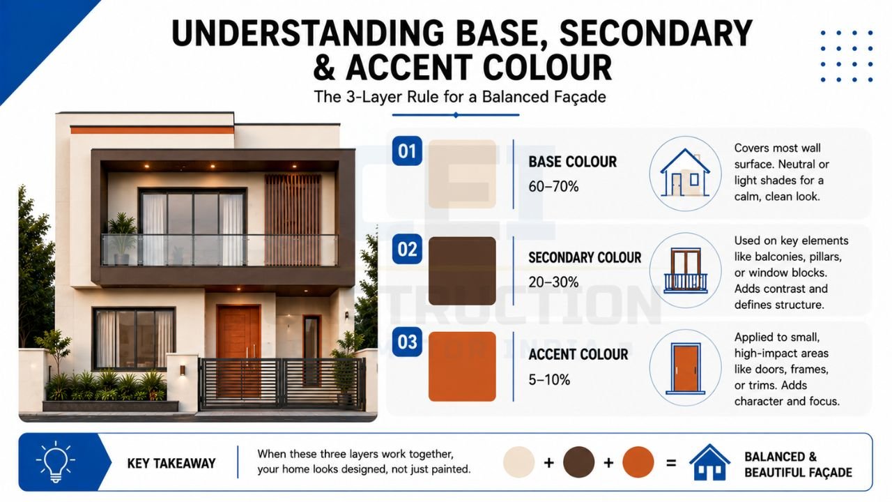
Understanding Base Colour, Secondary Colour, and Accent Colour
To achieve a professional-looking house colour combination outside, one must understand the three-layer rule. The first layer is the Base Colour, which covers the majority of the wall surface (typically 60-70%). This is usually a neutral or light shade to ensure the house doesn’t become visually exhausting. The second layer is the Secondary Colour (20-30%), used on significant architectural elements such as balconies, pillars, or specific window blocks. This shade should complement the base, providing enough contrast to define the building’s shape without clashing.
The final layer is the Accent Colour (5-10%). This is where you can be bold. Accents are applied to small but high-impact areas like the main door, window frames, or thin horizontal bands. These three layers must work in harmony to create a balanced façade. For example, a cream base with a chocolate brown secondary tone and a burnt orange accent is a classic Indian combination that feels warm and structured. Mastering this ratio ensures that your home looks designed rather than just painted, providing a sense of rhythm and balance that appeals to the eye.
👉 Choose the Ideal Exterior Colours to Enhance Your Home’s Beauty and Value.
Role of Light, Shade, and Surroundings
The intense Indian sunlight is the ultimate judge of your house colour combination outside. A shade that looks like a soft “Cloud Grey” in a cool showroom can often look like a stark, blinding white under the midday sun. When choosing a palette, you must consider the orientation of your house to maximize thermal efficiency in accordance with guidelines from the Indian Green Building Council (IGBC).
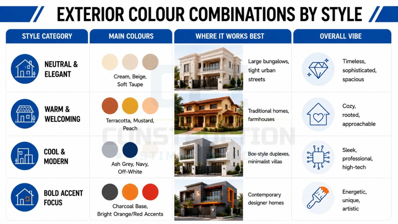
Surroundings also play a critical role. If your home is surrounded by lush greenery, earthy browns and terracotta accents will create a beautiful, organic connection with nature. However, in a dusty urban setting with grey roads and concrete structures, a purely grey house might look dull or “invisible.” In such cases, adding a warm cream or a vibrant accent can provide a much-needed break from the monotony. The first step in professional planning is to look at the overall vibe you want to project. The table below summarizes the most popular stylistic directions for Indian exteriors.
The following table compares different style categories for exterior colours, helping you identify which architectural “vibe” suits your family’s preferences.
| Style Category | Main Colours | Where It Works Best | Overall Vibe |
|---|---|---|---|
| Neutral & Elegant | Cream, Beige, Soft Taupe | Large bungalows, tight urban streets | Timeless, sophisticated, spacious |
| Warm & Welcoming | Terracotta, Mustard, Peach | Traditional homes, farmhouses | Cozy, rooted, approachable |
| Cool & Modern | Ash Grey, Navy, Off-White | Box-style duplexes, minimalist villas | Sleek, professional, high-tech |
| Bold Accent Focus | Charcoal Base, Bright Orange/Red Accents | Contemporary designer homes | Energetic, unique, artistic |
When using this table, identify the architectural style of your home first. If your house has many traditional carvings or a sloped roof, the “Warm & Welcoming” category is usually the safest bet. For modern, square-shaped buildings with glass railings, the “Cool & Modern” or “Bold Accent” styles will emphasize the sharp lines and contemporary materials.
👉 Give Your Home a Stunning New Look with Expert Colour Selection.
Popular House Colour Combination Styles for Outside
Neutral and Elegant Exterior Colour Combinations
Neutral palettes remain the most popular house colour combination outside for Indian homes because of their versatility and high resale value. This style relies on “Off-Whites,” “Creams,” and “Soft Beiges.” These colours are excellent at reflecting heat, which is a major advantage in tropical climates. A neutral house always looks fresh and clean, provided it is maintained well, a principle often emphasized in comprehensive project management consultancy (PMC).
Warm and Welcoming Outside Wall Colours
Warm colour combinations are deeply rooted in Indian culture, often inspired by natural clay, spices, and the golden hour sun. Using shades like light ochre, muted peach, or soft terracotta as a house colour combination outside creates an inviting atmosphere that feels like a “home” rather than just a structure. These tones work exceptionally well in suburban areas where there is a bit more space between houses. They harmonize beautifully with evening street lighting, glowing softly and creating a sense of security and warmth.
When working with warm tones, it is important to avoid overly saturated “neon” versions of these colours, which can look dated or cheap. Instead, look for “dusty” or “muted” versions of yellow and orange. A combination of a muted mustard base with a chocolate brown secondary tone and white trimmings is a quintessential Indian look that never fails. These colours also tend to hide the fine reddish dust common in many parts of India better than pure whites or cool greys, making them a practical choice for many households.
Cool and Modern Colour Combinations Outside
For homeowners moving toward a contemporary or “European” aesthetic, cool colour combinations are the go-to choice. These palettes feature ash grey, slate, ice blue, and crisp whites. A cool house colour combination outside is particularly striking on “Box Style” or “Industrial” architecture characterized by flat roofs and sharp angles. The contrast between a dark grey feature wall and a stark white projection can highlight the geometry of the building, making it a standout piece of modern art in the neighborhood.
However, cool tones can sometimes feel “clinical” or cold if not balanced correctly. To soften the look, architects often introduce natural elements like wooden rafters or warm LED strip lighting. A dark grey and white combination is extremely popular for double-floor houses in India currently, as it gives the building a premium, “urban” look. If you are planning a modern renovation, contacting Construction Estimator India can help you understand how much extra you might spend on premium “Silk” finish paints which are often required to make these cool tones look their best.
Bold Accent-Focused Combinations
Bold combinations are for the brave homeowner who wants their property to have a distinct identity. The secret to a successful bold house colour combination outside is restraint. Instead of painting the entire house in a bright colour, you use a neutral base—like a mid-tone grey—and then apply a vibrant colour like royal blue, deep maroon, or forest green to a single vertical column or a balcony band. This creates a “focal point” that draws the eye and gives the house a designer edge.
In many modern Indian apartments or row houses, bold accents are used to differentiate one unit from another. For example, a row of identical houses might use a consistent white base but vary the accent colour on the front porch. This adds variety while maintaining community harmony. When choosing a bold accent, always look at the color at different times of the day. A deep red might look like a rich wine colour in the morning but can turn into a harsh, distracting shade in the direct afternoon sun.
Colour Combinations for Different House Sizes and Types
Small House Outside Colour Combination Ideas
For a small house, the primary goal of a house colour combination outside is to create an illusion of scale. The most effective strategy is to use a light-coloured base with minimal contrast. When you use too many different colours on a small facade, it “breaks up” the visual flow, making the house look even smaller and cluttered. A monochromatic scheme—using different shades of the same colour—is often the best approach. For instance, using a very light grey for the walls and a slightly darker grey for the window frames keeps the look unified and expansive.
If you want to add interest to a small house without overwhelming it, focus on the entrance. A brightly coloured door or a small patch of stone cladding near the gate can provide character without eating up the visual space. Avoid using large, dark borders or heavy horizontal bands, as these can make a single-storey house look “squashed.” Light, airy colours like sea salt, pale cream, or light mint are excellent for making a compact Indian home feel breathable and modern.
Double Floor House Colour Combination Outside
A double-floor house offers a larger canvas and more opportunities to play with “zoning.” A popular technique is the “weighted bottom” approach. This involves using a slightly darker shade on the ground floor and a lighter shade on the first floor. This creates a sense of stability while the lighter top half makes it look taller and more elegant. For complex designs, ensuring structural alignment overseen by competent structural engineering design experts prevents awkward paint breaks.
The challenge with two-storey homes is ensuring the two levels don’t look like two different buildings stacked on top of each other. Consistency is key. Use the same window frame colour and the same accent tone on both floors to tie the design together. If you have a prominent staircase block, that is an excellent place to use a secondary colour or a texture paint. Planning a two-storey project requires careful budgeting for scaffolding and high-reach labor. You can reach out to Construction Estimator India on WhatsApp / Call +91 8630676890 to get an accurate quantity takeoff for your double-floor project, ensuring you don’t over-order expensive premium paint.
Corner Plot, Row House, and Apartment Front Colour Ideas
Corner plots are unique because they have two “fronts” visible to the public. The house colour combination outside must be consistent on both sides. A common mistake is focusing only on the main road side and neglecting the side lane, which can make the house look unfinished. Use the same base and secondary colours on both visible faces, perhaps using the accent colour more prominently on the main entrance side to signal its importance.
For row houses or apartments, your choice is often limited by what your neighbors have done. A house that is too different from the rest of the row can look like an eyesore, while one that is identical might lack personality. The best strategy here is to stay within the same “colour family” as your neighbors but choose a different shade or texture. If the street is mostly cream and beige, perhaps choose a soft taupe or a very light grey. This maintains neighborhood harmony while giving your home a subtle, distinct identity.
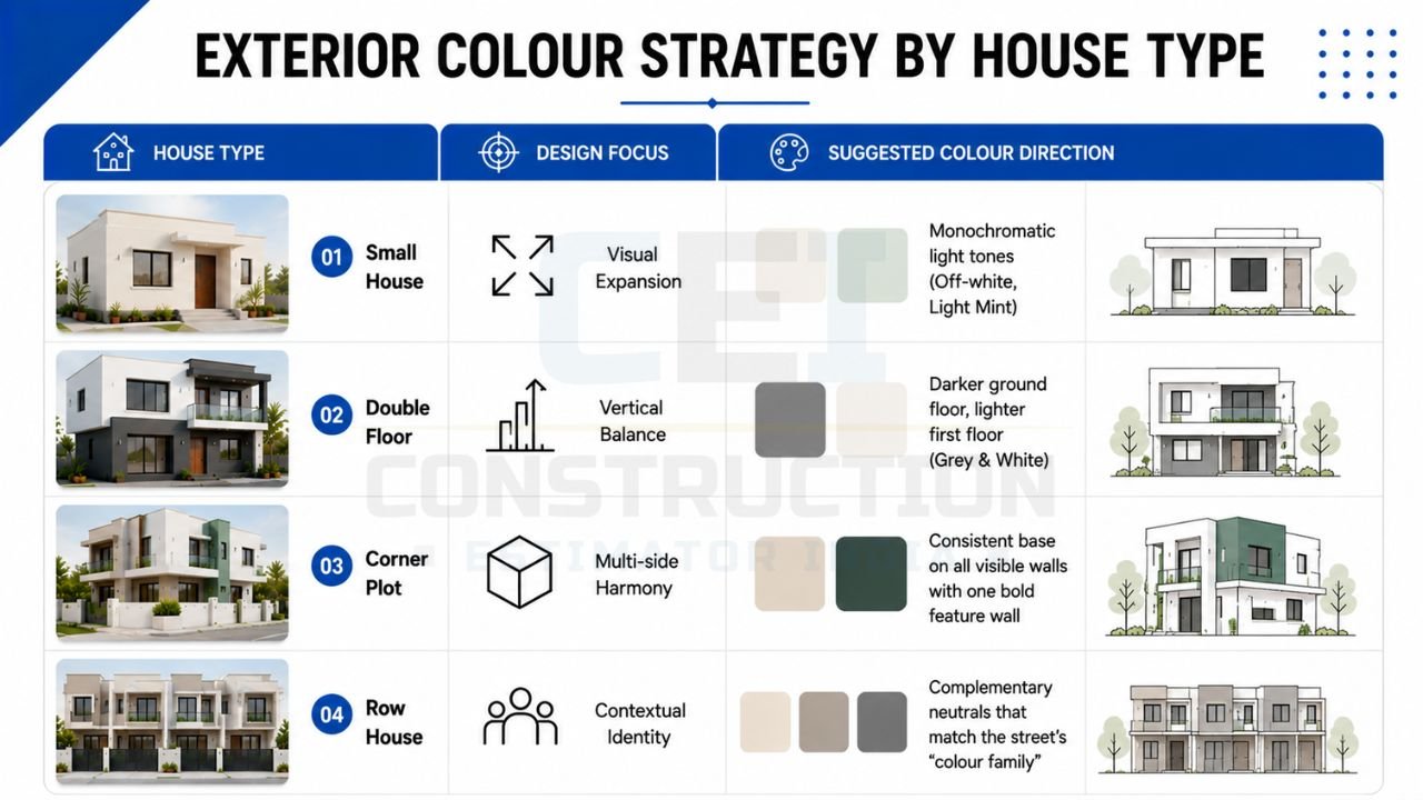
The following table connects various house types to specific design focuses and recommended colour directions to simplify your selection process.
| House Type | Design Focus | Suggested Colour Direction |
|---|---|---|
| Small House | Visual Expansion | Monochromatic light tones (Off-white, Light Mint) |
| Double Floor | Vertical Balance | Darker ground floor, lighter first floor (Grey & White) |
| Corner Plot | Multi-side Harmony | Consistent base on all visible walls with one bold feature wall |
| Row House | Contextual Identity | Complementary neutrals that match the street’s “colour family” |
Using this table helps you narrow down your choices based on your specific plot constraints. For instance, if you own a corner plot, your focus shouldn’t just be on a “pretty colour” but on ensuring that the “Multi-side Harmony” is maintained so the house looks grand from every angle.
👉 Find the Perfect Colour Combination for a Modern and Elegant Home Exterior.
Matching Exterior Colours with Climate and Maintenance
Colour Choices in Hot and Dusty Areas
In many parts of India, heat and dust are the two biggest enemies of a house colour combination outside. If your home is located near a main road or in a region prone to dust storms (like Rajasthan or parts of NCR), pure white is a risky choice. It will show every speck of pollution and rain streak within months. For these areas, mid-tone neutrals like “Sandstone,” “Dusty Beige,” or “Warm Grey” are much more practical. These colours camouflage the dust, allowing the house to look clean for much longer between washings.
Furthermore, in hot climates, the “heat island” effect is real. Dark colours absorb thermal energy, making the exterior walls hot to the touch and increasing the load on your air conditioning. If you must use dark colours, restrict them to the North-facing walls or small ornamental features. For the main West and South walls, stick to light, reflective tones. Modern paint technology now offers “heat-reflective” emulsions that can keep surface temperatures lower, though these come at a premium cost.
Colour Combinations for Coastal and Humid Regions
Coastal areas face the dual challenge of high humidity and salt-laden air. Choosing a paint with high “biocidal” properties helps water bead off the surface rather than soaking in. Ensuring rigorous water-proofing protocols, compliant with the Bureau of Indian Standards (BIS), is essential before topcoats are applied. Learning how to use white cement for waterproofing in India can save smaller leak issues near cornices.
Hill Stations and Cooler Regions
In the cooler, greener environments of hill stations like Shimla or Munnar, the rules of house colour combination outside change. Because the sunlight is less “harsh” and more “crisp,” deeper and richer colours look stunning. Deeper earthy tones, forest greens, or even a dark burgundy can look very sophisticated against a backdrop of mist and pine trees. These colours also help the house absorb a little bit of heat, which can be a welcome benefit during cold winters.
However, maintenance remains a concern due to high rainfall and moss growth. Using stone cladding on the lower half of the walls is a common and practical design choice in hilly areas, which can then be paired with a rich, dark-toned paint on the upper half. The key is to match the “richness” of the landscape. A bright, clinical white house might look out of place in a rustic, mountainous setting, whereas a “Sage Green” or “Deep Ochre” would feel perfectly at home.
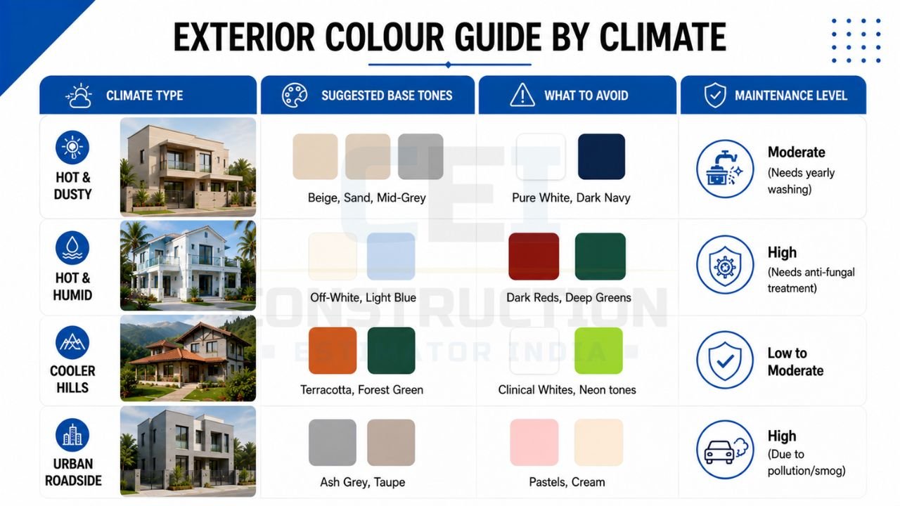
The following table summarizes how different Indian climates should influence your base tone selection and maintenance expectations.
| Climate Type | Suggested Base Tones | What to Avoid | Maintenance Level |
|---|---|---|---|
| Hot & Dusty | Beige, Sand, Mid-Grey | Pure White, Dark Navy | Moderate (Needs yearly washing) |
| Hot & Humid | Off-White, Light Blue | Dark Reds, Deep Greens | High (Needs anti-fungal treatment) |
| Cooler Hills | Terracotta, Forest Green | Clinical Whites, Neon tones | Low to Moderate |
| Urban Roadside | Ash Grey, Taupe | Pastels, Cream | High (Due to pollution/smog) |
Understanding this table is vital for long-term satisfaction. If you live in an “Urban Roadside” area, choosing a “Pastel” base is a decision you might regret within a year when the smog begins to dull the vibrancy. Instead, opting for an “Ash Grey” provides a more forgiving and durable aesthetic.
👉 Need Help Choosing Exterior Wall Colours? Consult Our Design Experts Today.
Coordinating Exterior Colours with Materials and Elements
Combining Paint with Stone, Tile, or Texture
The modern Indian home is rarely just painted; it is a collage of materials. When planning your house colour combination outside, you must account for the colours of any stone cladding (like slate or sandstone), wooden rafters, or wall tiles. A common mistake is choosing a paint colour that “fights” with the natural stone. If you are using a yellow-toned Jaisalmer stone, your paint should have warm undertones to match. If you are using a grey granite, a cool-toned paint will look much more harmonious.
Texture paints are also a major trend in India, used to create a “feature wall” on the facade. These textures—like stone-finish, metallic, or rustic—add a tactile dimension to the house. However, because texture paint is thicker and harder to apply, it costs significantly more than regular emulsion. Before committing to large textured areas, you should contact Construction Estimator India to get a comparison of material costs. This helps you decide if a textured feature wall fits your budget or if a similar effect can be achieved with a cheaper accent colour.
Doors, Windows, Railings, and Grills
The “trimmings” of your house—the doors, windows, and railings—are the jewelry of the architecture. They must be coordinated with the house colour combination outside. For a modern look, many homeowners are opting for black or charcoal grey powder-coated aluminum window frames. This dark “frame” looks exceptionally sharp against a light-coloured wall. For a more traditional or “royal” look, wooden frames or wood-finish uPVC are preferred, which pair beautifully with creams and warm earth tones.
Railings and grills should generally be painted in a single, consistent dark shade (like black, dark bronze, or deep grey) to avoid visual clutter. If you have many different metal elements—like a main gate, balcony railings, and window grills—keeping them the same colour creates a “unified” theme that ties the whole house together. Avoid painting grills in bright colours like green or red unless it is a very specific design choice, as it can make the house look “busy” and uncoordinated.
Roof, Parapet, and Boundary Wall Colours
The roofline and boundary wall are often the most overlooked parts of a house colour combination outside. The parapet wall (the small wall around the terrace) should usually be painted in the same colour as the secondary or accent tone to “cap” the building and give it a finished look. If you have a sloped roof with tiles, the colour of the tiles (typically terracotta or dark grey) must be the starting point for your entire palette.
The boundary wall should be treated as an extension of the house. While it doesn’t have to be an exact copy, it should use the same colour palette. A common professional tip is to use the secondary colour of the house as the main colour for the boundary wall. This creates a “frame” for the property, making the lighter-coloured house inside look more prominent and grand. Ensure that the gate colour matches the window frames or railings for a complete, well-thought-out design.
Practical Process for Choosing a House Colour Combination Outside
Shortlisting Colours from Shade Cards and References
The journey to a perfect house colour combination outside begins with inspiration. Start by collecting images of houses that you genuinely like, but filter them by “reality.” A house in the snowy suburbs of London will look very different in the dusty heat of Ahmedabad. Look for Indian references or houses in your own city. Once you have 5-10 images, identify the common theme. Are you drawn to greys? Or do you prefer warm beiges?
Once you have a direction, visit a paint dealer and pick up physical shade cards. Digital screens are notorious for distorting colours. A “Soft Peach” on your phone might turn out to be a “Bright Orange” in person. Narrow your choices down to three potential combinations. Each combination should have a clear base, secondary, and accent tone. Don’t try to mix and match from 20 different cards; stick to one or two “families” of colour to maintain a sophisticated look.
Testing Small Patches Before Final Decision
This is perhaps the most critical step. Never buy 100 liters of paint based on a 2-inch square in a shade card. Buy small “tester” cans of your shortlisted house colour combination outside and paint 2ft x 2ft patches on the actual exterior walls of your house. Place these patches on different sides—one on a wall that gets direct sun and one in a shaded area.
Observe these patches at different times: at 10 AM (bright morning light), at 2 PM (harsh midday sun), and at 6 PM (dusk). You will be surprised at how much the colour “shifts.” A colour that looks perfect in the morning might look completely washed out in the afternoon. Also, look at the patches from a distance—stand across the street to see how the combination looks from a neighbor’s perspective. This small investment in testing can save you lakhs of rupees in repainting costs if you don’t like the final result.
Estimating Quantity and Cost Before Painting
The cost includes surface preparation (scraping, putty, primer), labor for multiple coats, and scaffolding. By analyzing your building’s drawings, Construction Estimator India provides a detailed Bill of Quantities (BOQ). This prevents wastage and over-ordering.
Budget Planning for Exterior Colour Combinations
How Paint Type and Finish Affect Cost?
Basic exterior emulsions are affordable but premium “Weatherproof” emulsions are designed to last 7-10 years. “Satin” or “Silk” finishes require the wall surface to be perfectly smooth, which increases the cost of putty and labor. Always keep an eye on your baseline house construction per sq ft rate in India to ensure paint costs don’t disproportionately inflate your budget.
Balancing Premium Areas and Normal Areas
You don’t always have to use the most expensive paint on every single wall. A smart way to manage the budget for your house colour combination outside is to use premium, high-sheen, or texture paints on the “front-facing” walls that are visible from the road. These are the areas that define your home’s curb appeal. For the side and back walls—which are often hidden or face a neighbor’s wall—you can use a standard quality emulsion in a matching shade.
This strategy allows you to splurge on a stunning entrance or a beautiful balcony feature while keeping the overall project cost under control. Similarly, you can use expensive stone cladding only on the porch and use a “stone-finish” paint on the upper floor pillars to achieve a similar look at a fraction of the cost. Always discuss these “value engineering” options with a professional estimator to ensure the transition between different paint types looks seamless.

👉 Make Your Dream Home Stand Out with the Right Colour Palette.
How Construction Estimator India Supports Your Budget Decisions?
Choosing a house colour combination outside involves many “what-if” scenarios. The team at Construction Estimator India helps you run these scenarios on paper, providing accurate estimates for different paint brands and finishes through an intuitive online construction cost calculator.
Common Mistakes in Choosing House Colour Combinations Outside
Using Too Many Colours and Strong Contrasts
One of the most frequent errors in an Indian house colour combination outside is the “rainbow effect.” In an attempt to make the house look “grand,” owners often use 4 or 5 different bright colours. This results in a cluttered, restless facade that lacks a clear focal point. A professional design should ideally stick to no more than three main tones: Base, Secondary, and Accent.
Strong contrasts can also be tricky. While a black and white house looks modern, a “bright yellow and dark purple” house might be an eyesore. If you want contrast, stick to one neutral and one bold colour. Let the neutral tone do the heavy lifting and use the bold tone sparingly. Remember, the exterior of your house is something you (and your neighbors) will see every day for the next decade—simplicity and balance are your best friends for long-term satisfaction.
Ignoring Neighborhood Context and Regulations
Your house does not exist in a vacuum. A house colour combination outside that looks great in a modern gated community might look completely out of place in a traditional, historical colony. While you want your home to be unique, it should still “talk” to its neighbors. Look at the general height, material palette, and colour schemes of the houses on your street.
Additionally, many housing societies or development authorities in India have specific guidelines or “Color Codes” for exteriors to maintain a uniform look. Ignoring these can lead to legal notices or, worse, being forced to repaint your entire house at your own expense. Always check with your local RWA (Residents Welfare Association) or municipal office before finalizing a very bold or unusual colour scheme.
Choosing Colours Only from Digital Screens
As mentioned earlier, the “Digital Distortion” is a real problem. A house colour combination outside selected solely from a Pinterest board or a mobile app will almost always look different when applied to a 30-foot wall under the Indian sun. Digital images are often edited for lighting and contrast, which hides the true nature of the paint.
Always insist on physical shade cards and, more importantly, real wall samples. This is why testing patches is a non-negotiable step. Seeing the “real” paint interact with “real” brick and “real” sunlight is the only way to be 100% sure of your choice. Avoid the heartbreak of a “wrong” colour by taking the time to see physical samples in person.
FAQs: House Colour Combination Outside for Indian Homes
Which colour combination is best for a small house?
For a small house, the best house colour combination outside is a light, monochromatic palette. Shades like Cream, Off-White, or Light Grey help the house reflect more light and appear larger. Avoid heavy dark borders or multiple contrasting colours, as these “shrink” the visual size of the building. A single, subtle accent on the main door or a window frame is enough to add character without cluttering the facade.
Is white practical for outside walls in India?
Pure white is visually stunning but high-maintenance in dusty Indian cities. It can quickly show rain marks, pollution stains, and dust. A more practical alternative is “Off-White” or “Warm Cream,” which provides the same bright feel but is much more forgiving towards minor stains. If you choose white, ensure you use a premium “Easy-Clean” or “Dust-Guard” paint that allows you to wash the walls periodically.
How often does exterior paint need to be refreshed?
In most Indian climates, a high-quality exterior paint lasts between 5 to 8 years. However, walls facing the direct sun (South/West) or areas with very high rainfall may need a touch-up or a fresh coat every 4 years. Choosing premium “Silicon-based” or “Weatherproof” paints can extend this life up to 10 years. Regular maintenance, like cleaning the dust off with a water pipe once a year, also helps the paint look fresh for longer.
Do dark colours make the house hotter?
Yes, dark colours like Navy, Charcoal, or Deep Chocolate absorb more solar heat than light colours. This can increase the surface temperature of your walls significantly, which then transfers into your rooms. If you live in a hot region, it is best to use dark colours only as accents or on parts of the house that are naturally shaded. For the main walls, lighter tones are essential for natural cooling and energy efficiency.
When should I involve Construction Estimator India in my planning?
You should involve Construction Estimator India as soon as you have your architectural drawings and a general idea of the “look” you want. Before you buy any paint or hire a contractor, they can provide a detailed BOQ and cost estimate. This helps you understand if you can afford premium finishes or if you need to adjust your colour scheme to fit your budget. Contacting them during the conceptual stage prevents budget overruns and ensures a stress-free painting process.
Conclusion: Choose an Exterior Colour Combination That Looks Good and Works in Real Life
Finalizing your house colour combination outside is the crowning achievement of your home-building journey. It is the layer that protects your structure and expresses your family’s personality to the world. By balancing your personal taste with the practical realities of the Indian climate—such as heat, dust, and humidity—you can create a façade that remains beautiful for many years. Remember to follow the “Base-Secondary-Accent” rule, prioritize light-reflective tones for large surfaces, and always test your chosen shades on the actual walls before making a bulk purchase.
A successful exterior is not just about the right shade; it is about the right planning and budgeting. Avoiding common mistakes like over-colouring or ignoring neighborhood context will ensure your home stands out for the right reasons. Before you take the final step and start the painting work, take a moment to ensure your financial planning is as solid as your design. You are invited to contact Construction Estimator India on WhatsApp / Call +91 8630676890 to get a professional, accurate cost and quantity estimation for your exterior project. Their expert guidance will help you navigate the complexities of paint types and material requirements, ensuring that your dream house colour combination outside becomes a reality without any unexpected financial stress.